
Are you addicted to Spotify’s Discover Weekly? I certainly am. It often does a fantastic job of nailing my musical preferences and recommends me lots of music I really like and songs I don’t think I would have easily found any other way.
In today’s Tech Tuesday I will show you how Spotify’s algorithm works. It’s composed of three parts — and the third may really surprise you. Let’s dive in.
Deconstructing Spotify’s Algorithm
In data science parlance, Spotify’s Discover Weekly is a song recommender. In this case, their recommender uses information about millions of songs and “who listens to what” to make recommendations. And it generally does an astoundingly good job.
As I mentioned, Spotify uses three different types of recommenders to show you relevant music. They use a very common approach of building each recommender independently, then blending them at the end.
1. Collaborative Filtering
The first recommender type is very common: collaborative filtering. It’s the old “people who like what you like also like this, too”. It’s collaborative in the sense that it uses information from lots of other Spotify users. Many years ago Amazon gave the best overview of collaborative filtering I’ve ever read. Check it out here if you’d like to learn more.
2. Natural Language Processing (NLP)
NLP refers to the way computers can read and understand text. Spotify uses NLP technology to crawl reviews, music, and/or news sites for information on songs and artists. They do this to attain song attributes. Unlike a t-shirt that may have a henley neckline, is colored blue, and made of organic cotton (those are all attributes), songs and artists can often defy simple attribution. Spotify knows this, and so to better understand the music, they pull together all the information they can find online.
3. Pictures of the Music
Yes, you read it right – we’re literally talking about pictures of all songs. I’ll explain.
Spotify creates spectrograms of each song. These are pectoral representations of the frequencies (bass, midrange, and treble) over time and include amplitude. Here’s an example:
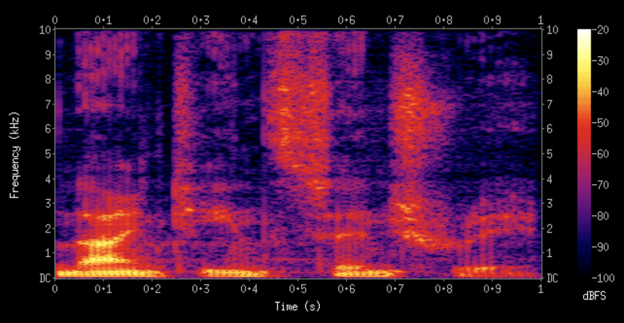
In a spectrogram, time goes from left to right. The higher frequencies are at the top, the lower frequencies at the bottom, and amplitude (loudness) is represented by color.
In the example above, you can see a lot of low-frequency (bass) in the beginning, followed by three more regions of increased bass.
Spotify uses images like these to do something similar to what facial recognition does, but instead of finding similar faces, it finds similar songs. Incredible, right!?
Finally, Spotify uses these three sources in concert (no pun intended) to recommend music week after week that you’re bound to love. It works, and is ingenious!
Read more about the algorithms Spotify uses here: How Does Spotify Know You So Well?
Of Interest
13 Essential Newsletters for Data Scientists: Remastered
When done right, newsletters are an excellent form of content curation that can help deliver interesting and insightful information to you with minimal effort on your part. Data newsletters are no exception to this rule. Here’s a list of 13 essentials newsletters for Data Scientists.
How Data Analysis, A.I., and the Internet of things (IoT) Will Shape the Post-Pandemic ‘New Normal’
When a contagion is raging, grassroots responses can be counterproductive. Lack of central coordination can confuse the situation for everybody, stoking a panic-driven infodemic that social media can exacerbate, drowning out guidance from public health officials and other reliable sources. Going forward, according to this article, we can expect to see more data-driven, top-down orchestration of pandemic preparedness and remediation among public, private, and nonprofit organizations.
Unique COVID-19 Charts
The human cost of coronavirus has continued to mount, with more than 22.3m cases confirmed globally and more than 779.200 people known to have died. The World Health Organization declared the outbreak a pandemic in March and it has spread to more than 200 countries, with severe public health and economic consequences. This article by the Financial Times provides a unique, up-to-date visual narrative of the spread of Covid-19. For a color-coded chart, visit this page by Covid Controls, and check out this version by Our World in Data as it offers yet another visualization of the data.