
This week I want to introduce some big, important changes to our COVID-19 Recovery Graphs along with a few related announcements.
Here’s what our main page looks like right now:
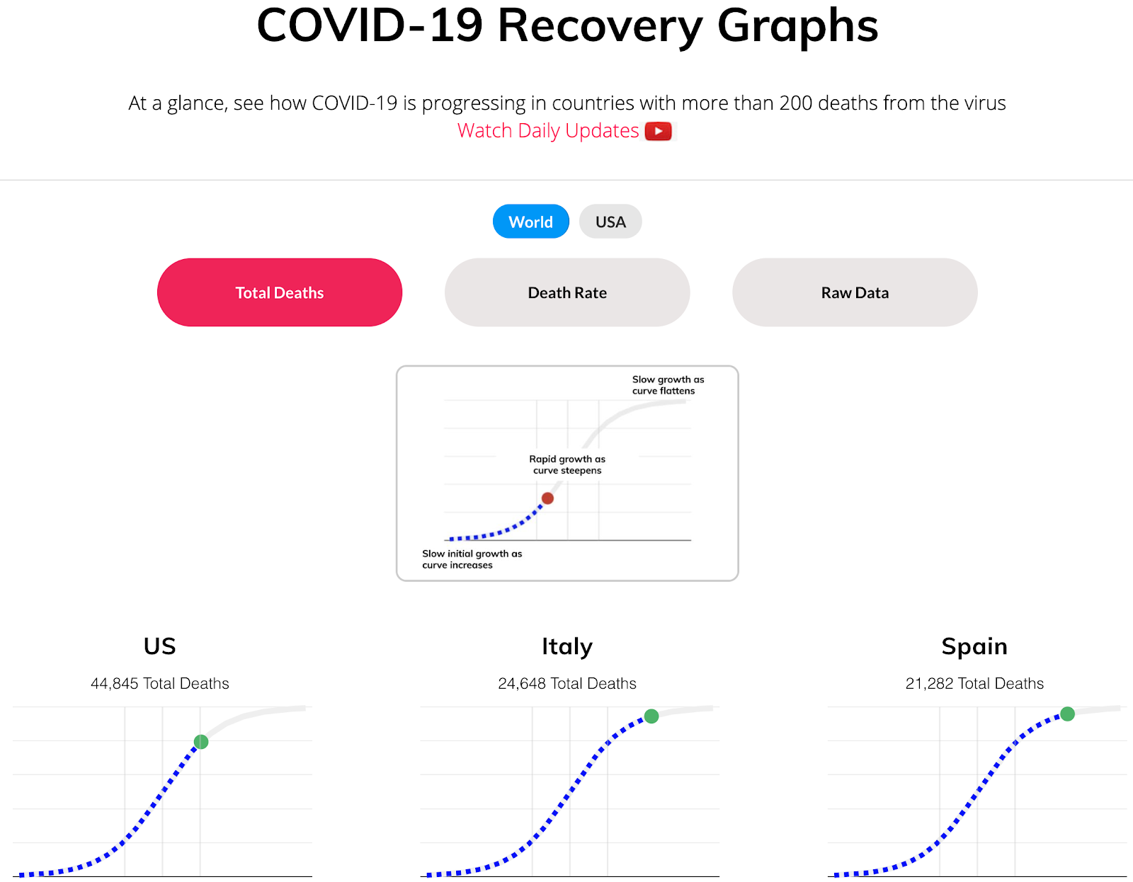
As discussed in our previous Tech Tuesday, our graphs have been tracking the progress of COVID-19 in numerous countries in real-time. And for good reason! It’s really important to know where we stand, where things seem to be going, and whether social distancing and staying inside are actually working.
With our recent improvements, the COVID-19 Recovery Graphs now show how regions are recovering from the pandemic and how close each area is to the goal of zero new deaths from the virus. We added data for each state in the United States. This is significant. Here’s why; The US appears to be effectively beating the virus, but at a closer look, states like New York are driving the data, having had most of the deaths from COVID-19.
By viewing state-by-state data, we can see that states with fewer deaths like California, Pennsylvania, Connecticut, and Colorado are actually not flattening. As of this writing, the death rates in each of those states is still rising.
Here’s what we’ve done to spread the word about how the world is recovering from COVID-19:
- We’ve created Recovery Graphs for each country in the world with greater than 200 deaths from the virus, and now, for each state in the USA
- We’re committed to airing daily update videos, talking about how countries and states are recovering, or unfortunately in some cases, relapsing
- We’ve also created a simulation that shows how dangerous it is when regions don’t recover quickly – here’s the video
Our COVID-19 Recovery Graphs show how regions are recovering from the pandemic and how close each area is to the goal of zero new deaths from the virus
Some important questions
The graphs are based on data provided by Johns Hopkins. It’s wrought with unknowns, but we believe it’s the best available data, currently.
Here are some of the questions or anomalies:
- China recently added new deaths from COVID-19, but the deaths were registered in such a way that there appear to be new deaths. This makes it seem as though they’re going through a new phase of the pandemic, but apparently, and hopefully, they are not. What’s really happening, is the deaths were all registered as new deaths, adding a spike to recent data that should not be there. Here’s another source for more information.
- Different countries and even states may be counting COVID-19 deaths differently:
“The federal government is classifying the deaths of patients infected with the coronavirus as COVID-19 deaths, regardless of any underlying health issues that could have contributed to the loss of someone’s life.” (New York Post). This could potentially result in over-counting. - On the other hand, there may be political pressure to undercount COVID-19 deaths, in hopes that regions can get their citizens “back to normal” as quickly as possible.
- Conversely, there may be pressure to over-count deaths as well, with the aim to attain aid meant for the hardest-hit regions.
One thing is for sure: it’s complex.
Even with all this noise, however, the data offered by the COVID-19 Recovery Graphs are very informative. They show you our best estimate on how a region, country, and/or state is recovering and indicate how close countries are getting to the important milestone of zero new deaths per day. We truly hope this will be reached sooner than later.
We at Bennett Data Science believe it’s of the utmost importance to make these graphs as digestible and informative as possible. We’ve already received a plethora of helpful feedback we implemented into this new version and every bit drives us towards a better way to provide you with the information you need. Hence, if you have any questions, concerns, or feedback, please do not hesitate to reach out and we will address this. Let us know what you think!
Thank you and be well,
– The Bennett Data Science team
Of Interest
Self-Reported COVID-19 Symptoms Show Promise for Disease Forecasts
Carnegie Mellon University researchers are gathering self-reported descriptions of COVID-19-related symptoms nationwide with the help of Facebook and Google, which apparently correlate well with test-confirmed cases of the disease – suggesting self-reports might soon help researchers in forecasting COVID-19 activity.
https://www.cmu.edu/news/stories/archives/2020/april/self-reported-covid-19-symptoms-disease-forecasts.htm
The Infinite Monkey Theorem Experiment
You’ve heard the one about monkeys typing Shakespeare, right? Well, here’s a fun look at monkeys (of sorts) playing Beethoven’s 5th. It’s fun and interactive. Make sure your volume is up!
https://pudding.cool/2020/04/infinite/
A.I. and Machine Learning for the Fashion Industry — Global Trends and Benefits
Through product personalization or better designing, there are multiple ways in which A.I. and machine learning technologies are impacting the global fashion industry. The increasing investments by leading fashion brands in these technologies are proof of their immense business potential. This article reviews the major areas where A.I. is being used to drive innovation in the fashion industry.
https://medium.com/datadriveninvestor/ai-and-machine-learning-for-fashion-industry-global-trends-benefits-3fe11a17849e