![[A First Look] Powerful A.I. Models to Track the Battle Against COVID-19](https://bennettdatascience.com/wp-content/uploads/2020/04/Predicting-Coronavirus-Bennett-Data-Science-A.I.-Models-scaled.jpg)
In these times, I think of how we can all contribute to the betterment of the world in light of the current state of affairs. As a Data Scientist, I’ve been preoccupied with this thought for weeks, and decided to build an A.I. model with one goal: to understand when a country is starting to win the battle against this virus that has us all on lockdown.
These predictions are useful to closely monitor trends in COVID-19-related deaths and make predictions earlier, that can help regions understand that they’re beating the virus and properly prepare for changing conditions.
This is work I haven’t seen anywhere else. My model was able to show a slowdown in COVID-19 related deaths in Italy a few days before the media were talking about it. It also indicates that the U.S. has yet to see the worst of the pandemic.
In this Tech Tuesday, I’ll share with you how I approached the problem, what some early results look like, and how to visualize the progression of COVID-19 in a way you likely have not seen before – put together in a format that’s easy to understand.
Here’s how it works
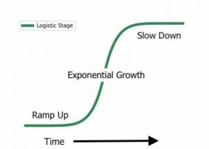
There are three main stages in viral growth. Generally, new infections exhibit:
- A slow ramp-up; succeeded by
- A very quick build as the virus spreads rapidly; followed by
- A slow tailing off as there are fewer and fewer people infected
These can be modeled in one step by something we call a “logistic” function – This function is characterized by a slow start, followed by an exponential growth period and finally a slow-down.
Here’s what that looks like:
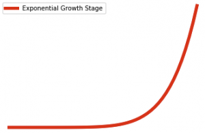
However, I want to break the curve into two separate regions:
- The ramp-up and exponential growth regions; and
- The slow down region
By presenting these curves separately, my intent is to help us all understand which region we’re in. Specifically, it’s essential that areas identify when they’re leaving the exponential growth region, as this indicates that hospitals can start to expect fewer cases. Using these curves, we can understand the direct consequences of mitigation measures, such as social distancing and staying isolated. It also describes a timeline required for the virus to run its path and eventually slow down.
The curves
Deaths related to COVID-19 are growing at an alarming rate. The death rate in the beginning stage follows the shape below. There are very few deaths for a long time until suddenly, the numbers increase rapidly. This is exponential growth.
However, at some point, this enormous growth rate begins to slow down, looking more like the top portion of the green curve below.

If we combine both plots, we see that the curves fit together well.
The red curve represents the worst-case scenario. The green the best-case scenario. And when we combine both curves, we get a high and low bound on the number of deaths from COVID-19 for a specific area.
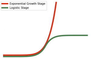
At the beginning of the outbreak, COVID-19 death rates follow the red curve. Then, at some point, depending on many factors such as whether or not we shelter in place and limit contact with others, the actual curve starts to flatten and look like the green curve.
When this starts to happen, we know that an area is winning the battle against COVID-19.
This is exactly what we’re seeing in Italy today. Take a look at my plot:
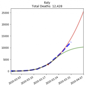
Things are getting better. The dashed blue line is the actual data, current to March 31st, and we can see that daily death rates in Italy are slowing from their exponential growth. In other words, they’re moving down below the red (worst-case) curve.
Notice how well the blue line followed the red curve in the beginning and then began to fall off the red curve, more mimicking the green curve.
The story for the United States is not so positive. Here’s the plot:
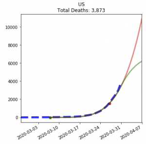
The blue line shows that the U.S. has a ways to go in the exponential growth stage before we see a slowdown. That’s on track with everything the CDC is saying. When that blue line dips below the red line, we’ll know a slowdown in COVID-19-related deaths is happening.
I’m working to make this a live dashboard so we can look to for answers and updates on a daily basis. Once completed, you’ll be able to monitor the plots, interact with and share them. If you have any questions or requests, please feel free to hit reply and let me know.
I would like nothing more than to make these findings more accessible to people who want them. If you would like to talk to me about how to use this information or share it, please hit reply. I would love to hear from you.
Please stay inside if you can. Be well!
Of Interest
Making sense of Artificial Intelligence
This absolutely beautiful A-Z guide offers a series of simple, bite-sized explanations to help anyone understand what A.I. is, how it works, and how it’s changing the world around us. It’s also simply captivating to look at!
https://atozofai.withgoogle.com/
The Most Important Recent Research in Artificial Intelligence and Machine Learning
Breakthroughs in A.I. come at an ever more rapid pace. This document is meant to be a bridge between the newest research and its relevance for businesses, product leaders, and data science teams across the world:
https://spark.adobe.com/page/8r3T7EAqvFx7w/
How to Get Beautiful Results with Neural Style Transfer
Neural Style Transfer is nothing new. It’s how we turn a photo of ourselves into something that Picasso must have painted. In this article, Eugen Hotaj clearly explains that it’s not that easy to create Neural Style Transfers and gives a full walkthrough of how to get stunning results with small tweaks to how most approach this problem.
https://towardsdatascience.com/how-to-get-beautiful-results-with-neural-style-transfer-75d0c05d6489