![Understanding Covid Cases Quickly [A Walkthrough]](https://bennettdatascience.com/wp-content/uploads/2021/07/Bennett-Data-Science-Tech-Tuesdays-Understanding-Covid-Cases-Quickly--scaled.jpg)
I recently spent a bit of time in Europe, and with COVID cases rising, it was important for me to understand the numbers that might drive policy (read: closures) that may affect my time there.
This week I want to show a lightweight way to get COVID related information quickly. I’ll show you how I quickly assess a region and expose some of the caveats of the data to help you understand the biases that exist.
To get to the main dashboard page, simply search Google for “covid cases worldwide”. That brings up a page that should look something like this:
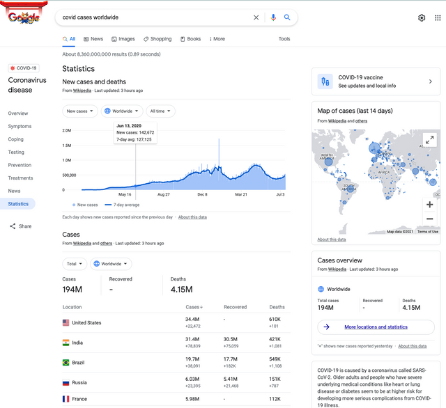
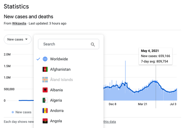
The center plot allows you to search for countries around the world, with many allowing a deeper dive into specific regions:
From this plot we can already see that the number of cases is rising worldwide. Now, let’s look at Italy, which is showing increased cases recently – perhaps due to the celebrations associated with their recent soccer win over England.
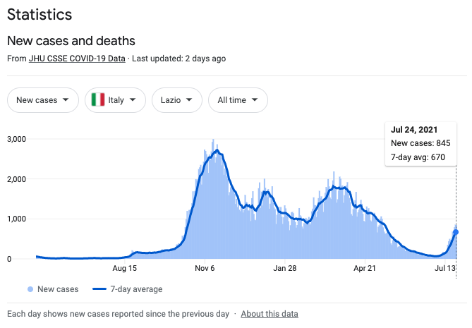
I selected the Lazio region where Romans were doing a lot of celebrating a couple weeks ago. Whether or not it was from large gatherings, we see a marked uptick in the number of new cases. Of note as well is that the “7-day avg” number (670) is quite a bit different than the raw count “New cases” (845). This disparity happens when there are big changes in numbers, as evidenced by the strong positive slope of the blue curve in late July, 2021.
I like these plots for another reason; they allow me to compare conditions to previous times.
Let’s take a look at The Netherlands, where they just experienced a huge spike in cases. Let’s take a look at how the recent spike compares to others since the beginning of the pandemic:
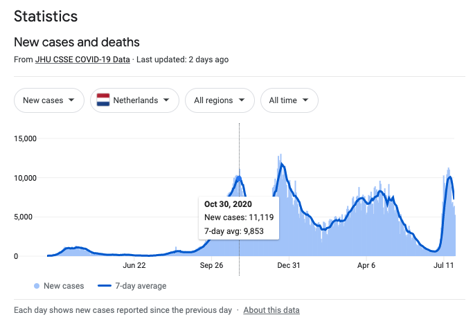
Notice how I used my cursor to go back to the end of October 2020? We can see that the recent spike was as high as that period, but not quite as big as the one towards the end of 2020. This provides a relative scale for us to understand the severity of outbreaks.
But, of course, this isn’t the entire story. There’s a lot buried in the details here.
For example, these charts say nothing of the ages of those infected. We know that the elderly are affected very differently from the young, so these spikes we see may not lead to hospitalizations in many cases.
We also don’t know how many tests were administered over various time windows. From a high level, more testing will find more cases. And various countries report differently, not only to other countries but over time.
Additionally, reading about the data tells us that these numbers:
- Include confirmed and probable cases, leaving the decision up to local officials
- Show positive tests, not positive cases, so a single person may be counted multiple times
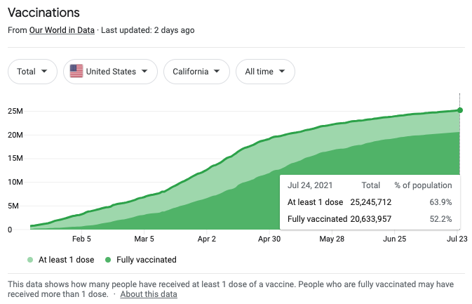
Finally, the bottom of the page gives some info on vaccines. Here we see that California is reporting greater than a 50% vaccination rate:
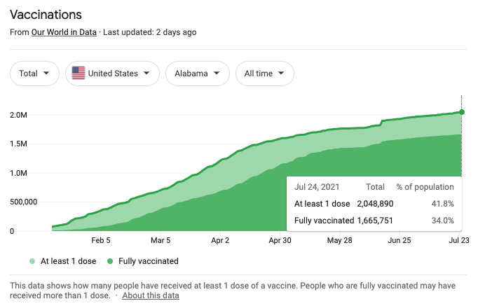
Alabama, by contrast, shows a 34% vaccination rate:
I hope these charts help you understand what you may be hearing in the news as we navigate rising cases across the globe.
Here’s to your health and wellbeing!
-Zank
Of Interest
A man Used A.I. to Bring Back his Deceased Fiancé
After Joshua Barbeau’s fiancé passed away, he spoke to her for months. Or, rather, he spoke to a chatbot programmed to sound exactly like her. In a story for the San Francisco Chronicle, Barbeau detailed how Project December, a software that uses A.I. technology to create hyper-realistic chatbots, recreated the experience of speaking with his late fiancé. All he had to do was plug in old messages and give some background information, and suddenly the model could emulate his partner with stunning accuracy. As amazing as this sounds, however, the creators warn it could be dangerous and used to spread misinformation.
A.I. Predicts Structures for a Vast Trove of Proteins
In an advance that could revolutionize life sciences, Google’s sister company DeepMind has predicted the structure of nearly the entire human proteome (the full complement of proteins expressed by an organism). In addition, the tool predicted almost complete proteomes for various other organisms, ranging from mice and maize (corn) to the malaria parasite. This is absolutely revolutionary.
Entering the Age of Acceleration with Post-Pandemic A.I.
Overall, it’s been a very good year for A.I. and the companies developing it. So much so that Alphabet CEO Sundar Pichai, in a recent podcast recorded by BBC, says: “I view [A.I.] as a very profound enabling technology. If you think about fire or electricity or the internet, it is like that, but I think even more profound.” Read about the impact that advances in A.I. are having on companies around the world here.